
Last week I talked about the test shoot that we conducted to find the appropriate look for the film. The basis of which came from the concept art that Sam Mardon created for us.
I found Sam’s website and liked the look of his other work so simply sent him an email explaining our project and if he would be interested in working on it. He did and we got straight to work developing the first piece of art.
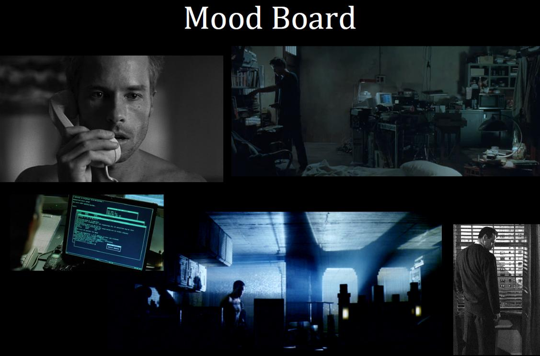
Most of the film will be shot from behind Guy’s computer so I wanted to get a visualisation of that first to show the crew. To form a brief I sent Sam notes on the colour, the props and Guy’s build and appearance. I also sketched a very rudimentary map of the apartment (this is before I’d made a 3D model) so that Sam understood the geography of the set that was in my head, and attached a mood board which is an assortment of photos, all from other films, to convey the… well, mood. It looks like this…
I found Sam’s website and liked the look of his other work so simply sent him an email explaining our project and if he would be interested in working on it. He did and we got straight to work developing the first piece of art.
Most of the film will be shot from behind Guy’s computer so I wanted to get a visualisation of that first to show the crew. To form a brief I sent Sam notes on the colour, the props and Guy’s build and appearance. I also sketched a very rudimentary map of the apartment (this is before I’d made a 3D model) so that Sam understood the geography of the set that was in my head, and attached a mood board which is an assortment of photos, all from other films, to convey the… well, mood. It looks like this…
Finally, I attached the script to give Sam an understanding of what he was drawing – some context. This is what I got back…
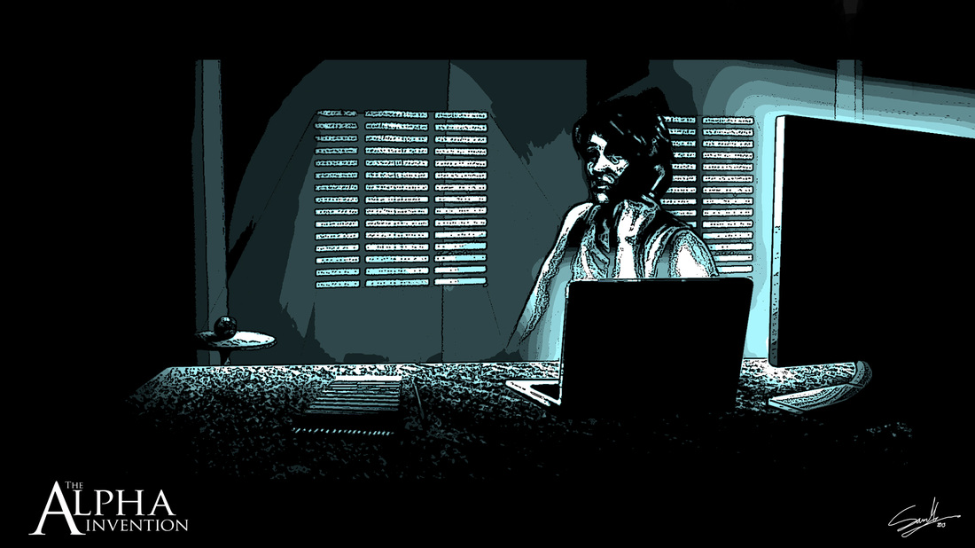
Which obviously looks great and ticked most of the boxes right out of the gate (many more so than I was expecting actually). I just gave a few bits of feedback regarding the windows being bigger, the light being emphasised, a few more details on the computer and giving Guy a notepad to draw on. And…
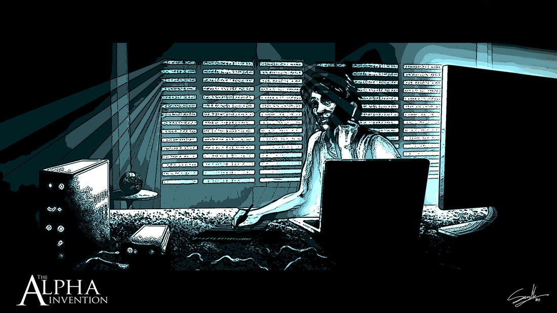

Perfect.
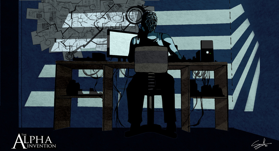
The second piece of concept art had to convey two key things – a reverse angle which is naturally another important shot; and a key piece of set dressing, the map on Guy’s wall. Without giving too much away I can say that this is a “tree of life” of sorts that Sam designed and dropped into his artwork.
This will be made into full scale mural by the art department for shooting and placed on that very wall. It will serve us well for inserts and cutaways and once you've seen the film it might make a bit more sense on second viewing.
 RSS Feed
